Back

The Truth Behind Amazon’s Logo

There are moments in a designers day in which they feel obligated to critique something. Most of the time, that comes from being constantly critiqued. It serves as an backlash for feeling like they get yelled at all day.

In this particular case, I wasn’t being critiqued. I was buying a slip and slide, and noticed something odd about Amazon’s logo…
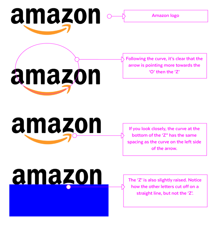
Amazon infamously has their logo setup to model the ‘A to Z’ phrase, inferring that they have everything from A to Z. However, If you look closely, the arrow isn’t actually pointing at the ‘Z’…It’s pointing directly at the ‘O’… that means, they only have everything from “A to O”. This lead me to believe there is much more to this company then meets the eye.

Think about it, there is no way they did that on accident. If you notice on the last two examples above, they specifically made adjustments to the ‘Z’, even giving it perfect padding. You can’t tell me that they don’t know the arrow is pointing to the ‘O’.

Now, onto the conspiracy theory… Since they are only offering things from ‘A to O’, that means Amazon’s currently only offering ~60% of it’s ‘real’ services. If you haven’t heard, Amazon is also involved in competing with SpaceX.

My theory is that, Amazon is spending it’s remaining resources (or letters in the alphabet) to put humans on Mars. Since Bezo seems to love competing with Space X, it’s the only logical assumption. Just saying… you heard it here first…